Keep your Tabs and List in sync using Jetpack Compose

Jetpack Compose
In May 2019, Google announced a new UI toolkit for Kotlin developers. In July 2021 the first stable version of this toolkit was made available. So, it is a fresh but I believe very promising toolkit. Some of the benefits of using the Jetpack Compose will be mentioned below.
We need to write less code to achieve the same results
A classic example is the RecyclerView where we needed to write a lot of XMLs (the number is based on the supported list items' types) and to implement an Adapter for handling things like binding the data and when a UI element should be recycled or not. With Jetpack Compose the same result could be achieved with a couple of lines of code.
Stop using XMLs for declaring our UI
Everything can be written in Kotlin (although there is interoperability with the old UI system) and placed in the same class or package. Cognitively, things are easier by writing only Kotlin and by not navigating between src and res packages.
State handling is much easier and less error-prone
We just define our state, which is the only source of truth. This state is observable and is observed by the corresponding UI element. By observing its state, every UI element knows when a refresh (a.k.a recomposition) needs to be performed.
In general, it seems that Compose can speed up the development process and lessen errors. In this blog post, we will showcase how easy is to implement complex UI elements with Jetpack Compose.
What we want to achieve
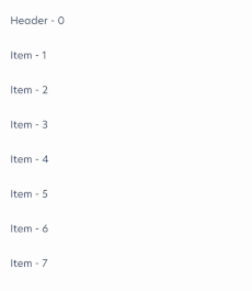
Before putting our hands-on writing some code, we need to specify what we want to implement. Firstly, we must display a list of items. These items are going to be grouped and for each group, a header item will be displayed in the list. Above the list, we want to display some tabs. The tabs display the same title with headers. When we scroll the list, the tabs should be scrolled too in order to inform the user which group is currently visible. Lastly, if the user clicks on a tab, then the list will auto-scroll to the corresponding group. The result should look like that:
Implementation
We start with something unrelated to Compose and not fancy at all 😛. We declare the models of the items that we want to display in order to be easier to follow the next lines of code. Our items can be either a Header or a Detail. Both of them have a title and an index of the corresponding header (this will helps to know into which tab we need to scroll).
sealed class Item(
	open val title: String,
	open val headerIndex: Int
) {

	data class Header(
		override val title: String,
		override val headerIndex: Int
	): Item(title, headerIndex)

	data class Detail(
		override val title: String,
		override val headerIndex: Int
	): Item(title, headerIndex)
}
Before we start declaring our UI, we must say that Compose is built around composable functions. Composable functions are functions that are annotated with @Composable and let us define our UI programmatically by describing how it should look. In Compose, we can display a list of items in two ways. We can use a LazyColumn or a Column. The best way is LazyColumn because it renders only the currently visible items. We can think of it as the RecyclerView for Compose. The implementation is easy, we just invoke LazyColumn and inside its lambda expression, we invoke the item function. This function helps us to render a single item in our list. Basically, all we have to do is to declare into the item all the composables that need to be rendered for every Header or Detail.
@Composable
private fun ListItems(
    state: LazyListState,
    dataItems: List<Item>
) {
    LazyColumn(state = state) {
        dataItems.forEach {
            item { Text(text = it.title) }
        }
    }
}
We need to notice two things here. The first one is that we passed a state in our composable. We will talk about it later on. The second is that it is by far much less code than implementing an adapter for a RecyclerView.
For displaying scrollable tabs we just need to invoke the ScrollableTabRow. Then inside the ScrollableTabRow, we need to invoke Tab for each header item.
@Composable
private fun Tabs(
    selectedTabIndex: Int,
    scrollToItem: (Header) -> Unit,
    tabItems: List<Header>
) {
    ScrollableTabRow(selectedTabIndex = selectedTabIndex) {
        tabItems.forEachIndexed { index, item ->
            Tab(
                selected = selectedTabIndex == index,
                onClick = { scrollToItem(item) }
            ) {
            	Text(text = item.title)
            }
        }
    }
}
At this point, we have defined our basic components, but we do nothing with them. We need to render them all together. So, we need to create a new composable that stacks both composables together. We can use a Column for that. In addition, we must create the state for our composables. This state should be observable, to cause recomposition whenever its value change. Also, we must avoid recreating it on every recomposition. This is achievable with the remember family of functions.
@Composable
fun AutoTabsList(dataItems: List<Item>) {
	val scrollToItem = ... // we will define it later on

    val tabs = dataItems.filterIsInstance<Header>()
    val selectedTabIndex = remember { mutableStateOf(0) }
    val listState = rememberLazyListState()

    Column {
        Tabs(
            selectedTabIndex = selectedTabIndex.value,
            scrollToItem = scrollToItem,
            tabs = tabs
        )

        ListItems(
            listState = listState,
            dataItems = dataItems
        )
    }
}
With almost no effort we have created our UI! The syncing is not implemented yet, but we can see why Compose makes development faster. Now it is time to define how the list is going to be scrolled when the user clicks a tab. For this, we will need to use the list's state. It provides us with a function that scrolls the list to a specific index. This function is named animateScrollToItem. The problem with this function is that needs a coroutine scope. We can create a coroutine scope inside a composable with the rememberCoroutineScope. As we have everything in place, we can now create a function that returns another function which takes as a parameter a Header and uses it to find the index in the list to scroll to. After finding the index, it uses the list's state to scroll to this index.
@Composable
fun AutoTabsList(dataItems: List<Item>) {
    val coroutineScope = rememberCoroutineScope()

    val scrollToItem = scroller(
        listState = listState,
        coroutineScope = coroutineScope,
        dataItems = dataItems,
    )

    // The rest code remains the same as we saw in the previous gist
}

private fun scroller(
    listState: LazyListState,
    coroutineScope: CoroutineScope,
    dataItems: List<T>,
): (Header) -> Unit = { header ->
    coroutineScope.launch {
        val tabIndex = dataItems.indexOf(header)
        listState.animateScrollToItem(index = tabIndex)
    }
}
The last thing that we need to implement is auto-scrolling the tabs whenever the user scrolls the list. Obviously, this would escape the scope of the function where it was called. This means that it is a side-effect. Compose provides us with side effect handlers. Previously, we used the rememberCoroutineScope side effect handler. Another useful side effect handler is LaunchedEffect. LaunchedEffect is used whenever a job is scoped by composition and rememberCoroutineScope is used whenever a job is scoped by user interaction. So LaunchedEffect seems a more appropriate candidate here. After selecting the side-effect handler, we can listen to the list's state and check the first item that is visible. If the item belongs to a different group, then we will select the corresponding tab.
LaunchedEffect(listState) {
    snapshotFlow { listState.firstVisibleItemIndex }
        .mapNotNull {
            dataItems[it].headerIndex
        }
        .distinctUntilChanged()
        .collectLatest {
            selectedTabIndex.value = it
        }
}
Conclusion
Using Jetpack Compose to create our UI made the process of development simpler, faster, and funnier. Also, it seems much more powerful than Views. By passing composables inside other composables we can create UIs with a high level of abstraction. This abstraction leads us to higher reusability and scalability. Additionally, it seems that every designer's idea is possible to be implemented with Jetpack Compose. I guarantee that you won't say again that a prototype is nearly impossible to be implemented. Another thing that we did not mention is that testing UI it seems much simpler compared to the old system. Probably this is a topic for another post though. 😉
You can access a simple library which doing what was described in the above post here